
WordPress 5.8 から搭載された theme.json で設定できるフィールド、自分用メモ。(21/10/20時点)
Block Editor モジュールの InnerBlocks コンポーネントで複数のブロックをひとまとまりにしたカスタムブロックを作る
WordPress のブロックエディタで投稿する際、案件によっては「これらのブロックがひとまとまりになったブロックがあれば良いのに」というケースがある。
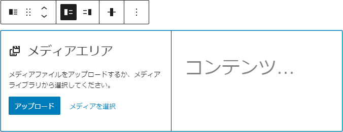
デフォルトで用意されているブロックでは「メディアと文章」ブロックのように画像と段落がセットになっているものがそれにあたる。
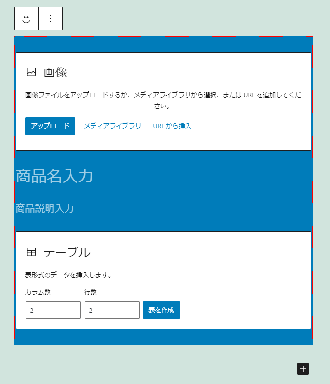
案件で想定されるものとしては、画像・見出し・段落・テーブルをひとまとまりとした「商品情報ブロック」といったもの。
(WordPress 5.5 から導入されたブロックパターンでそれができるかなと思っていたが、ブロックパターンで作成したパターンは投稿のルートに挿入されグループブロックやカラムブロックの中に挿入できない)
「商品情報ブロック」はデフォルトで備わっているブロックで構成されているため、1カラムのカラムブロックを作成しその中に画像ブロック、見出しブロック、段落ブロック、テーブルブロックを積み重ねていけば目的のものはできる。
しかし商品が幾つもあり且つユーザ側で商品情報を投稿するケースを考えた場合上記の方法は現実的ではない。
そこで画像・見出し等をひとまとまりとしたブロックを用意しユーザ側ではそのブロックを挿入し必要な情報を入力するだけとする。
@wordpress/create-block パッケージでカスタムブロックのひな形となるプラグインを生成
Create Blockによるプラグイン生成は以下参照。
プラグイン名はgutenitemとする。
$ npx @wordpress/create-block gutenitem
// gutenitem ディレクトリが生成される
$ cd gutenitem
$ npm start // 開発用ビルド開始
InnerBlocks コンポーネントで商品ブロックを作成する
InnerBlocks コンポーネントで他のブロックを内包することができるブロックを作成できる。
詳しくは公式ドキュメント参照。
ほぼ公式ドキュメントのままとなるが edit.js 及び save.js を編集していく。
edit.js
import {
	InnerBlocks,
	useBlockProps
} from '@wordpress/block-editor';

import './editor.scss';

// 「商品情報ブロック」定義
const MY_TEMPLATE = [
	[ 'core/image', {} ],
	[ 'core/heading', { placeholder: '商品名入力', level: 3 } ],
	[ 'core/paragraph', { placeholder: '商品説明入力' } ],
	[ 'core/table', {} ]
]

export default function Edit() {
	const blockProps = useBlockProps();
	return (
		<div { ...blockProps }>
			<InnerBlocks
				template={ MY_TEMPLATE }
				templateLock="all"
			/>
		</div>
	);
}#2InnerBlocks コンポーネントを追加
#20-23InnerBlocks をレンダリング。template プロパティを使用するとブロックが挿入された際の初期状態のブロックの構成を定義できる。定義内容は #9-14 で指定。template プロパティについては後述。templateLock プロパティで作成したブロック内でのブロックの入れ替えや新規ブロックの挿入をロックできる。all を指定すると入れ替え・挿入を行えなく、insert を指定すると新規ブロックの挿入は不可となるがブロックの入れ替えは可。
save.js
import {
	InnerBlocks,
	useBlockProps
} from '@wordpress/block-editor';

export default function save() {
	const blockProps = useBlockProps.save();
	return (
		<div { ...blockProps }>
			<InnerBlocks.Content />
		</div>
	);
}
#2InnerBlocks コンポーネントを追加
#10InnerBlocks.Content をレンダリング。入れ子になったブロックのコンテンツを自動的に置き換える。
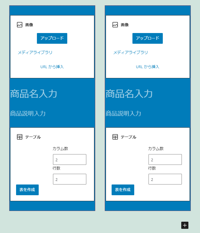
保存しビルドを行い WordPress 投稿画面で gutenitem ブロックを選択すると想定していた「画像、見出し、段落、テーブル」がひとまとまりになったブロックが挿入された。
あとは通常のブロック同様に情報を入力。

以上で InnerBlocks コンポーネントを使用してのカスタムブロック作成完了。
以下駄文。
InnerBlocks コンポーネントの template プロパティについて
edit.js で template プロパティにセットする値は配列 [ ブロック名, 属性(オプション) ] で定義する。
(参考)
gutenberg/block-templates.md at master · WordPress/gutenberg
edit.js
const MY_TEMPLATE = [
	[ 'core/image', {} ],
	[ 'core/heading', { placeholder: '商品名入力', level: 3 } ],
	[ 'core/paragraph', { placeholder: '商品説明入力' } ],
	[ 'core/table', {} ]
]上記の[ 'core/heading', { placeholder: '商品名入力, level: 3 } ]
であれば、
ブロック名: core/heading
属性: { placeholder: '商品名入力, level: 3 }
となり Gutenberg コアの見出しブロックが挿入され、プレースホルダーには「商品名入力」と表示、見出し要素は h3 となる。
これらブロックの情報は Gutenberg コアに含まれるブロックであれば GitHub の Gutenberg Block libraryページ(gutenberg/packages/block-library at master · WordPress/gutenberg)の src ディレクトリ以下に各ブロックのディレクトリがあるのでその中の block.json に記載されている。また、Gutenberg コアに含まれるブロック以外のブロックも指定できる。
core/heading ブロックの block.json は以下の通り。(一部省略)
(参考)
https://github.com/WordPress/gutenberg/blob/master/packages/block-library/src/heading/block.json
block.json
{
"apiVersion": 2,
"name": "core/heading",
"category": "text",
"attributes": {
"textAlign": {
"type": "string"
},
"content": {
"type": "string",
"source": "html",
"selector": "h1,h2,h3,h4,h5,h6",
"default": ""
},
"level": {
"type": "number",
"default": 2
},
"placeholder": {
"type": "string"
}
},
"supports": {
(略)
},
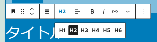
}例えばブロック挿入初期状態でテキストセンタリング、「タイトル」というテキストが入力されている、見出しレベル h4 としたい場合は以下のようになる。
[ 'core/heading', { textAlign: 'center', content: 'タイトル', level: 4 } ]ここで気になるのが textAlign や level の値として何を指定するのが正しいかであるが、(textAlign であれば left, center, right、level であれば 1~6 というのは想像できるとは思うが)、仮に
[ 'core/heading', { textAlign: 'hoge', content: 'タイトル', level: 8 } ]としてもビルド時にエラーを吐かず、エディタ側では
<h8 role="group" aria-multiline="true" aria-label="ブロック: 見出し" class="block-editor-rich-text__editable block-editor-block-list__block wp-block is-selected has-text-align-hoge rich-text" contenteditable="true" id="block-e8382e04-b569-4596-a2fd-5402aca1f3af" tabindex="0" data-block="e8382e04-b569-4596-a2fd-5402aca1f3af" data-type="core/heading" data-title="見出し" style="white-space: pre-wrap;">タイトル</h8>フロント側では
<h8 class="has-text-align-hoge">タイトル</h8>と出力されてしまうので適切な値を指定する必要がある。
見出しブロックの属性の適切な値を調べる
見出しブロック選択時にはツールバーが表示され、見出しレベル、テキスト配置共にドロップダウンリストが用意されているのでこれらの選択肢の値が適切な値であると想像できる。
見出しブロックのソースは gutenberg/packages/block-library/src/heading at master · WordPress/gutenberg にあり edit.js が見出しブロックのレンダリングを行っているので見てみる。
edit.js
/**
 * External dependencies
 */
import classnames from 'classnames';

/**
 * WordPress dependencies
 */
import { __ } from '@wordpress/i18n';
import { createBlock } from '@wordpress/blocks';
import {
	AlignmentToolbar,
	BlockControls,
	RichText,
	useBlockProps,
} from '@wordpress/block-editor';
import { ToolbarGroup } from '@wordpress/components';

/**
 * Internal dependencies
 */
import HeadingLevelDropdown from './heading-level-dropdown';

function HeadingEdit( {
	attributes,
	setAttributes,
	mergeBlocks,
	onReplace,
	mergedStyle,
} ) {
	const { textAlign, content, level, placeholder } = attributes;
	const tagName = 'h' + level;
	const blockProps = useBlockProps( {
		className: classnames( {
			[ `has-text-align-${ textAlign }` ]: textAlign,
		} ),
		style: mergedStyle,
	} );

	return (
		<>
			<BlockControls>
				<ToolbarGroup>
					<HeadingLevelDropdown
						selectedLevel={ level }
						onChange={ ( newLevel ) =>
							setAttributes( { level: newLevel } )
						}
					/>
				</ToolbarGroup>
				<AlignmentToolbar
					value={ textAlign }
					onChange={ ( nextAlign ) => {
						setAttributes( { textAlign: nextAlign } );
					} }
				/>
			</BlockControls>
			<RichText
				identifier="content"
				tagName={ tagName }
				value={ content }
				onChange={ ( value ) => setAttributes( { content: value } ) }
				onMerge={ mergeBlocks }
				onSplit={ ( value ) => {
					if ( ! value ) {
						return createBlock( 'core/paragraph' );
					}

					return createBlock( 'core/heading', {
						...attributes,
						content: value,
					} );
				} }
				onReplace={ onReplace }
				onRemove={ () => onReplace( [] ) }
				aria-label={ __( 'Heading text' ) }
				placeholder={ placeholder || __( 'Write heading…' ) }
				textAlign={ textAlign }
				{ ...blockProps }
			/>
		</>
	);
}

export default HeadingEdit;
31行目の const { textAlign, content, level, placeholder } = attributes; で template プロパティで指定した属性を受け取っていそう。level は 44行目からの HeadingLevelDropdown コンポーネントで、textAlign は 51行目からの AlignmentToolbar コンポーネントで使用されており、これらのコンポーネントが見出しレベル、テキスト配置ドロップダウンリストを構成していそうなのでそれぞれのソースを見てみる。
gutenberg/packages/block-library/src/heading/heading-level-dropdown.js
heading-level-dropdown.js
/**
 * WordPress dependencies
 */
import {
	Dropdown,
	Toolbar,
	ToolbarButton,
	ToolbarGroup,
/**
 * WordPress dependencies
 */
import {
	Dropdown,
	Toolbar,
	ToolbarButton,
	ToolbarGroup,
} from '@wordpress/components';
import { __, sprintf } from '@wordpress/i18n';
import { DOWN } from '@wordpress/keycodes';

/**
 * Internal dependencies
 */
import HeadingLevelIcon from './heading-level-icon';

const HEADING_LEVELS = [ 1, 2, 3, 4, 5, 6 ];

const POPOVER_PROPS = {
	className: 'block-library-heading-level-dropdown',
	isAlternate: true,
};

/** @typedef {import('@wordpress/element').WPComponent} WPComponent */

/**
 * HeadingLevelDropdown props.
 *
 * @typedef WPHeadingLevelDropdownProps
 *
 * @property {number}                 selectedLevel The chosen heading level.
 * @property {(newValue:number)=>any} onChange      Callback to run when
 *                                                  toolbar value is changed.
 */

/**
 * Dropdown for selecting a heading level (1 through 6).
 *
 * @param {WPHeadingLevelDropdownProps} props Component props.
 *
 * @return {WPComponent} The toolbar.
 */
export default function HeadingLevelDropdown( { selectedLevel, onChange } ) {
	return (
		<Dropdown
			popoverProps={ POPOVER_PROPS }
			renderToggle={ ( { onToggle, isOpen } ) => {
				const openOnArrowDown = ( event ) => {
					if ( ! isOpen && event.keyCode === DOWN ) {
						event.preventDefault();
						event.stopPropagation();
						onToggle();
					}
				};

				return (
					<ToolbarButton
						aria-expanded={ isOpen }
						aria-haspopup="true"
						icon={ <HeadingLevelIcon level={ selectedLevel } /> }
						label={ __( 'Change heading level' ) }
						onClick={ onToggle }
						onKeyDown={ openOnArrowDown }
						showTooltip
					/>
				);
			} }
			renderContent={ () => (
				<Toolbar
					className="block-library-heading-level-toolbar"
					label={ __( 'Change heading level' ) }
				>
					<ToolbarGroup
						isCollapsed={ false }
						controls={ HEADING_LEVELS.map( ( targetLevel ) => {
							const isActive = targetLevel === selectedLevel;
							return {
								icon: (
									<HeadingLevelIcon
										level={ targetLevel }
										isPressed={ isActive }
									/>
								),
								title: sprintf(
									// translators: %s: heading level e.g: "1", "2", "3"
									__( 'Heading %d' ),
									targetLevel
								),
								isActive,
								onClick() {
									onChange( targetLevel );
								},
							};
						} ) }
					/>
				</Toolbar>
			) }
		/>
	);
}
26行目の const HEADING_LEVELS = [ 1, 2, 3, 4, 5, 6 ]; が適切な値っぽい。
gutenberg/packages/block-editor/src/components/alignment-toolbar/index.js
index.js
/**
 * External dependencies
 */
import { find } from 'lodash';

/**
 * WordPress dependencies
 */
import { __, isRTL } from '@wordpress/i18n';
import { ToolbarGroup } from '@wordpress/components';
import { alignLeft, alignRight, alignCenter } from '@wordpress/icons';

const DEFAULT_ALIGNMENT_CONTROLS = [
	{
		icon: alignLeft,
		title: __( 'Align text left' ),
		align: 'left',
	},
	{
		icon: alignCenter,
		title: __( 'Align text center' ),
		align: 'center',
	},
	{
		icon: alignRight,
		title: __( 'Align text right' ),
		align: 'right',
	},
];

const POPOVER_PROPS = {
	position: 'bottom right',
	isAlternate: true,
};

export function AlignmentToolbar( props ) {
	const {
		value,
		onChange,
		alignmentControls = DEFAULT_ALIGNMENT_CONTROLS,
		label = __( 'Change text alignment' ),
		isCollapsed = true,
	} = props;

	function applyOrUnset( align ) {
		return () => onChange( value === align ? undefined : align );
	}

	const activeAlignment = find(
		alignmentControls,
		( control ) => control.align === value
	);

	function setIcon() {
		if ( activeAlignment ) return activeAlignment.icon;
		return isRTL() ? alignRight : alignLeft;
	}

	return (
		<ToolbarGroup
			isCollapsed={ isCollapsed }
			icon={ setIcon() }
			label={ label }
			popoverProps={ POPOVER_PROPS }
			controls={ alignmentControls.map( ( control ) => {
				const { align } = control;
				const isActive = value === align;

				return {
					...control,
					isActive,
					role: isCollapsed ? 'menuitemradio' : undefined,
					onClick: applyOrUnset( align ),
				};
			} ) }
		/>
	);
}

export default AlignmentToolbar;
13行目の DEFAULT_ALIGNMENT_CONTROLS で定義されてる align が適切な値っぽい。
・・・というか Alignment Toolbar コンポーネントについてはドキュメントが用意されてた…
gutenberg/packages/block-editor/src/components/alignment-toolbar
というわけで大雑把に属性に指定する適切と思われる値を調べたけど手間が掛かり過ぎるのできちんと調べるとブロックごとに属性に関するドキュメント用意されていたりするのだろうか。
見出しブロックは属性名から値が容易に想定できたのでブロックの初期状態を定義するの簡単だけど core/table ブロックの block.json みると複雑そうだ。
https://github.com/WordPress/gutenberg/blob/master/packages/block-library/src/table/block.json
Gutenberg の Create Block パッケージを使用してカスタムブロックを作る
公式でサポートされているブロックの作成方法である@wordpress/create-blockを使ってカスタムブロック用のプラグインを生成する。
詳細は以下ブロックエディターハンドブックに記載されているので参照。
作成されたカスタムブロックは定型文を挿入するだけの単純なものであるが、@wordpress/create-blockで生成されるプラグインにはブロック作成に必要なファイルやビルド環境が一式揃っており、独自のカスタムブロックを作成したい場合はこれをベースにカスタマイズを行っていく。
開発環境(バージョンは執筆段階のもの)
- Node.js(14.15.2 LTS 推奨版)
- npm(6.14.9)
- WordPress(5.6)
参考)開発環境 – Japanese Team — WordPress.org - VS Code
使い方
$ npx @wordpress/create-block [options] [slug]VS Code のターミナルで WordPress のプラグインディレクトリに移動して以下コマンドを実行する。(今回はプラグイン名を gutenitem とした)
$ npx @wordpress/create-block gutenitem処理が走って gutenitem ディレクトリが生成される。
npx: 206個のパッケージを18.66秒でインストールしました。
Creating a new WordPress block in "gutenitem" folder.
Creating a "block.json" file.
Creating a "package.json" file.
Installing packages. It might take a couple of minutes.
Formatting JavaScript files.
Compiling block.
Done: block "Gutenitem" bootstrapped in the "gutenitem" folder.
Inside that directory, you can run several commands:
  $ npm start
    Starts the build for development.
  $ npm run build
    Builds the code for production.
  $ npm run format:js
    Formats JavaScript files.
  $ npm run lint:css
    Lints CSS files.
  $ npm run lint:js
    Lints JavaScript files.
  $ npm run packages-update
    Updates WordPress packages to the latest version.
You can start by typing:
  $ cd gutenitem
  $ npm start
Code is Poetry
cd gutenitemでプラグインディレクトリに移動。
生成されたファイルは以下の通り。(一部省略)
/build/ディレクトリ(略)
/node_modules/ディレクトリ(略)
/src/
/src/index.js
/src/edit.js
/src/save.js
/src/style.scss
/src/editor.scss
/.editorconfig
/.gitignore
/block.json
/gutenitem.php
/package.json
/package-lock.json
/readme.txt
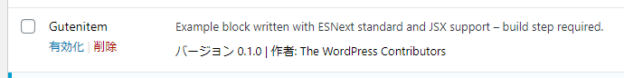
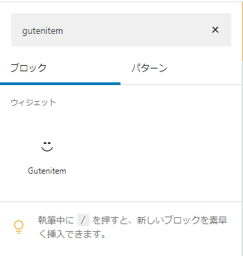
WordPress プラグインページを確認すると Gutenitem プラグインが追加されているので有効化。
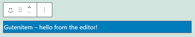
投稿ページのブロック一覧に追加されており選択すると定型文が挿入される。
以上でブロックのひな形は完成。
ここからプラグインのカスタマイズを行い独自のブロックを作成していくが本記事ではひな形作成まで。
生成されるプラグインについて
冒頭で@wordpress/create-blockで生成されるプラグインにはブロック作成に必要なファイルやビルド環境が一式揃っていると書いたがそちらについて簡単に説明。
ファイル
生成されたファイルのうち主にsrcディレクトリ内のファイルをカスタマイズしカスタムブロックを作成していく。index.jsがブロックのメインスクリプトとなる。またそのなかでも edit 関数及び save 関数がスクリプトのメインとなるため生成されたプラグインではedit.js、save.jsと別ファイルで保存されておりindex.jsから import されている。style.scssはフロント、管理画面共通で読み込まれるスタイル、editor.scssは管理画面用のスタイルとなる。
/src/index.js
/src/edit.js
/src/save.js
/src/style.scss
/src/editor.scss
コマンド
package.jsonにはブロック作成の際に役に立つ scripts がいくつか用意されている。
{
	…
	"scripts": {
		"build": "wp-scripts build",
		"format:js": "wp-scripts format-js",
		"lint:css": "wp-scripts lint-style",
		"lint:js": "wp-scripts lint-js",
		"start": "wp-scripts start",
		"packages-update": "wp-scripts packages-update"
	},
	…
}
$ npm run build本番用のコードをビルドする。
$ npm start開発用のビルドを開始する。常にコードの変更を監視しており、コードに変更を加えるとスクリプトが自動的に再構築される。またコードの記述にエラーがあった場合はビルドエラーが表示される。gulp watchやnpm run watchのようなイメージ。